


Vtuber, utaite, & Idol Logo Exercises
vtuber's are youtubers that use 2d or 3d characters tracking facial movements to live stream, sing or record videos with. Utaite's are people that cover songs produced originally for vocaloid voice banks to preform. Kagai Idols are over seas Japanese idol inspired performers.
Some creators are all three some are only one but I wanted to get some experience creating logos in the general style many of the creators in these niches have.
I started with sketching out existing logos such as Iron Mouse and Rachie to get an understanding of vtuber logos layouts and how the character design influences the logo
physically sketching them myself also let me take into account the crammed yet cohesive nature of many of these designs


All throughout these sketches I was pointing to different aspects of the Vtuber's had taken from their models to put into consideration how aspects of my characters should be taken into account for my practices.


When starting this goal I wanted to really push myself and decided to take the most undesirable name and turn it into something someone would want to click on. I noticed a stuffed animal named "Beef Stick" photographed to the left and decided this was an enjoyable challenge.
My Role
Brand designer
Objectives
Create a logo for a stuffed meerkat in the style of a Vtuber
Audience
Late Millennial to Early gen Z Vtuber/Utaite fans
Message & Tone
Off just the logo design I wanted the audience to get a sense of humor as well as some animistic qualities.
Assets & Deliverables
Logos


after developing a lot of the logo it still felt unfinished so I tried adding glitter however the first one felt too seperate and the second one was too much so I decided to take it away and restart before any glitter
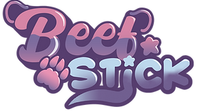
After going back to the drawing board I realized that the logo didn't scream animal. So I added some assets to highlight that this is a meerkat. I referenced real meerkats when making the paw so its a little more elongated then cats or dogs and added a tail to the "i" to tie it together.


I accidently didn't save the log so I went back to the drawing board a little adding in some more gradients and a halftone style to more of the lower half of the logo. to finish Beef Stick off.


Following Beef Stick I wanted to create a logo based on a full fledged character and chose to rebrand an old YouTube channel in the process
My Role
Brand designer, asset designs, character designer, artist
Objectives
Create a character and design a logo based off her and a salamander of my choosing
Audience
Late Millennial to Early gen Z Vtuber/Utaite fans
Message & Tone
The biggest message I wanted people to experience was what to expect from who you were about to see on screen. The character has star assets and heart shaped hair so I wanted those to be immediately noticeable.
Assets & Deliverables
Logo, character art, YouTube end card (Pending), channel banner (Pending), vtuber model (Pending)
This project was started 8/23 but I wanted this included in my logo design work to be considered in certain applications so other aspects of this project have yet to be completed but will be updated down the line.
When I started using this account I drew myself how I looked. since then I have decided I wanted to have a character more then a representation. I drew a character with aspects that I draw myself with however also make sure she not just a slight reskin by leaning into a hearts and stars motif.


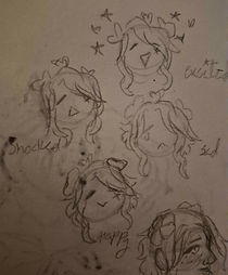
The finished piece was from around December as an example of the old character the only consistent part between every video was the hair color however in the new design the hair style colors (once its colored in) and star mark are all going to be consistencies creating a stronger impression of the character.

Once the character was designed I moved on to creating a logo in the first sketch idea I had the idea to put a star as the counter's in the letter "a"

I started this project by writing the whole logo and playing with different fonts that I thought played together well involving the star "a" and heart script.

After deciding the font I then had to decide how contain the letters. As well as the colors and make sure the font was still legible with how squished I made it

I wanted to use the red and blue hair from the old design in the new one as well but didn't quite like where it was going dubbing this the "Seinfeld logo"

I chose to restart to record my process and in this trial added the Ahego from the new design and shift the bottom text closer to the center of the logo

this time round I experimented with some gradients as the base for the logos and started developing patterning to overlay

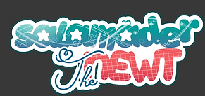
I wanted to have variety between both parts of the logo however looking at newt it wasn't at the same level as "salamander" text. So I looked at some actual salamanders for reference specifically the red salamander who's pattern almost looks like halftones so I added some as stars to fit into both themes

After adding some finishing touches outlines, realizing I misspelled "salamander" that entire time, and deciding to making all of newt capital. The logo was finished.